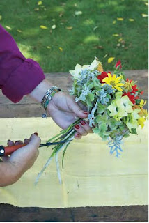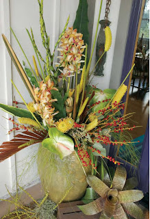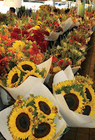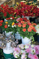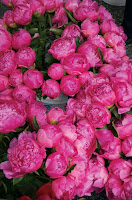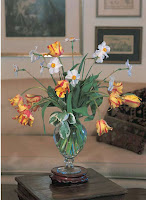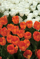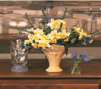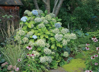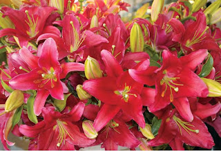
Nowadays color is the carrier of emotion, not the specific type of flower. Red is vividlypassionate and conveys the strongest statement of love. We may think first of redroses, but any bouquet predominantly red can carry the message of intense feeling.Modern red roses may be stiff and are commonly presented in a formal way, but abouquet of fiery tulips says the same thing: “I adore you, and your beauty renders mespeechless. I can only tell you with flowers.”Yellow, while gaining momentum as the color of friendship and sociability, is stillburdened by visions of jealousy and lost love. In the nineteenth century, yellow wasthe color that expressed having “the blues.” Although we now associate yellow withwarmth and cheer, as well as intelligence and a lively mind, this ancient burden ofsadness has never fully been transferred to blue. After the reign of the sunflower as adecorating motif in the 1990s, there is no getting around it: in our current age yellowis primarily thought to be the color of sunlight, stimulating our eyes and lifting ourspirits.Having “the blues” is a relatively modern concept. Blue is also the color of healingand serenity. It is the family of hues least stimulating to the color sensors in our eyes,and we can look at shades of blue for a much longer period than mixed tints of redor yellow. It is the traditional color of forgiveness (spouses in the doghouse woulddo better to send ten blue iris than a dozen red roses, whose color further might stirthe ire of a wronged mate), and when the merest touch of red is added, blue becomesthe color of enchantment, purple. Blue must be pure to photograph well, and thehuman eye is easily fooled into seeing blue where it does not exist, as in the feathersof birds.Creating bouquets with mixed colors, as long as the relative strength of hue isthe same, always strikes me as festive and stimulating. Others prefer monochromaticcombinations, where tones vary only slightly from flower to flower; the effect is morecalming and, some would say, elegant. Depending on the context of such an arrangement,I might also find it boring. Still others might want the simple contrast of justtwo opposing colors—yellow and blue, purple and orange—to set in motion a pleasingvibration that will be bright but will not clash.Here are some color terms that you might find useful to know and that will helpyou better communicate your preferences.
black: Black is the absence of any color wavelength and does not appear in a spectrum.
color-sensitive cells: There are three types of color-sensitive cells in the humaneye, all known as cones, each responding to one of the three primary colors.Rods detect only differences in tones (amount of light as compared one color toanother).
color wheel: A color wheel is a circle of colors formed by taking a linear spectrumand connecting the ends. This wheel helps us visualize which colors are in whichprimary groups, what harmonizes and what contrasts.
contrasting colors: Contrasting colors are those colors that lie on opposite sides ofthe color wheel from each other (for example, orange and purple).
cool colors: Cool colors fall into the blue-influenced half of the color wheel andinclude all tones of blue, purple, violet, and green.
harmonious colors: Harmonious colors are those colors that are adjacent to eachother on the color wheel (for example, purple and blue).
hue: A hue is created when black is added to a fully saturated color (for instance,blue + black = navy blue). This term is often used interchangeably with shade.
pastel color: A pastel color is created when a saturated color is diluted by 50 percent(or more) white.
primary colors: The three primary colors—that is, those basic colors found in theirpure form in nature—are red, yellow, and blue. All other colors are combinations,tints, or hues of these three colors.
saturation: Saturation refers to the intensity of a color. The more pure a coloris, the greater its intensity or saturation. The level of saturation is changed in gardensby blending colors with lighter, darker, or variegated companions.


