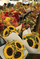
Creating bouquets with mixed colors, as long as the relative strength of hue isthe same, always strikes me as festive and stimulating. Others prefer monochromaticcombinations, where tones vary only slightly from flower to flower; the effect is morecalming and, some would say, elegant. Depending on the context of such an arrangement,I might also find it boring. Still others might want the simple contrast of justtwo opposing colors—yellow and blue, purple and orange—to set in motion a pleasingvibration that will be bright but will not clash.Here are some color terms that you might find useful to know and that will helpyou better communicate your preferences.
secondary colors: Secondary colors are those three colors created by blending thethree primary colors together: green (blue + yellow), orange (red + yellow), andviolet (red + blue).
spectrum: The spectrum is the immutable order of light wavelengths producingvisible color as sunlight passes through the earth’s atmosphere (red to orange toyellow to green to blue to indigo to violet). It starts with infrared and ends withultraviolet.
tint: A tint is created when white is added to a fully saturated color (for instance, red+ white = pink).
tone: Tone is the measurement of brightness (lightness or darkness). Violet has adark tone, yellow has a light tone. White and black are tonal extremes.warm colors: Warm colors fall into the red-influenced half of the color wheel andinclude all tones of red, orange, yellow, gold, and the hot pinks.
wavelengths: Color is created by light from the sun traveling through our atmosphereat various speeds. The shorter (faster = shorter) the wavelength, thebrighter the color. Red is fast (has a short wavelength), blue is slow (has a longerwavelength).
white: White is the combination of all color wavelengths and so does not appear ina spectrum.

0 коментара:
Публикуване на коментар